from Information Is Beautiful
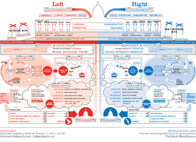
have created this Left vs. Right concept map
to help explain the differences in political opinions.
They created two versions: One for the U.S. (top) and one for the World (below).

http://www.informationisbeautiful.net/leftvright_US.html
There are two versions with different colours: a US and a World version. This is because the US and Switzerland are the only countries in the world where red = right wing and blue = left wing.

http://www.informationisbeautiful.net/leftvright_world.html
Click on the links below each illustration to go to full page views that are easier to read.


No comments:
Post a Comment